Friday, 27 September 2013

Ancillary Research 5, Magazine Advertisement, Noel Gallagher's High Flying Birds, UK Tour 2012


This is a magazine advert for Noel Gallagher's 2012 UK arena tour, it was used magazines such as Q and NME prior and during the sales of tickets. The look of the poster is based on the album, this makes it instantly recognisable to the target audience. The picture was here is Gallagher standing under the roof of a petrol station, it is positioned so that there is some dark sky to the right of it where the logo can be placed to make it stand out, there is a slightly distorted band at the top to make all the logo stand out even on the petrol station roof. Gallagher is centered because he is what is being advertised here, people always look at the middle of the page and that is what they'll see if they're just flicking through. There is a translucent blue box which is quite dark making it go with the theme of colours, it gives some selling points such as saying where the album charted and listing some of the singles, there are then some quotes from reviews such as a review from the telelgraph and Q, they also include a star rating on the album being promoted for each one. There is also a row of other ratings from various magazines and newspapers such as Q and The Daily Mail. In bolder text than anything else in the blue box it says UK Arena Tour 2012, this stands out so the reader knows what is being advertised straight away. At the very bottom there is some yellowish-brown text which says Tickets avaliable now at NoelGallagher.com this stands out more due to the change in colour and it means there is no confusion on where to get tickets from. The bottom right has SourMash which is Noel Gallagher's label and then the website is featured again, this is put in the bottom right of the page because this is the last thing the reader will see before turing the page so it will stay in their head possibly making them go on the website and purchasing tickets or other products. 


Ancillary Task Research 4, Digipack, Kasabian, Kasabian Live!

The 2nd digipack I will be researching is Kasabian LIVE! This is a triple gatefold digipack


This is the cover of the digipack, features a picture of the band in a isolated looking concert, this picture is actually a still from the video for Switchblade Smiles which was on the album they were promoting at the time of this concert. The white background works well with the dark picture of the band, the bands logo in bold, black text and then the LIVE! being in much larger, bold, red text, this contrast to the background means it attracts the consmers eye.

When the packaging is first opened there are 2 panels, the left one gives the track listing, one column for each disc and on the right there are the credits such as the band members, managers and designers


This is the opposite view to the last, this time we see the cover again and now we see the back, when the digipack is fully folded these are the components you can see. The spine has a similar effect of the cover, the regular Kasabian logo is used to make it insantly recognisable, the white background is used with the bold black text again to make it stand out. The red Live In London isn't as bold or striking as the Kasabian logo as it isn't as important, it still contrasts against the background though so it does stand out. The back is numbered, this makes cosumers want to buy it more as they know it's very limited, this one here is 1799/5000. There is a picture of a black feather, this is a theme the band used throughout this tour, in many concerts the guitarist Sergio Pizzorno wore a parka with black feathers around the hood. The small text is details and copyright information, below that is the bar code, the record label logos and then Kasabian's website and the concert recorders website


This packaging is now fully folded out, this shows the 2 compartments for the discs which are plastic in this case rather than card slots where they slide in. We can also see the track listening again which is probably purposely designed so that it is linked with the discs


Here we can also see all 3 panels, we aren't seeing any panels we haven't seen here before though, its the cover, the back and the band members/managers 

Thursday, 26 September 2013

Ancillary Task 3, Magazine Advertisement, The Courteeners, Anna Tour 2013


This is a magazine advertisment for The Courteeners and their tour for to promote their latest album Anna which was released in March, The top features Courteeners written in a bright, blue font made to look like a neon light, with the black background this cathes the eye straight away. The woman in the middle of the poster is the picture used on the album cover, here though this is made to look like a neon light as well, in concerts there was a large neon light used of this image, this bright pink against the blue of Courteeners it stands out even more and is near impossible for the reader to miss. Below live is in a bright blue text, this drags the reader to that section and then they check the concerts to see if any are close to them possibly influencing their decision to go or not. Inside the pink box is another concert, this location is in a similar blue text before, this is because this one is significant to the rest, The Courteeners are from Manchester meaning that is a home coming gig which they expect to sell out. At the bottom there are details on how to get tickets promoters, websites and other information concerning the band or the conerts.

Ancillary Task Research 2, Digipack, Sex Pistols, Live In Trondheim 21st July 1977

This is my first piece of research for the ancillary task, I have chosen a selection of digipacks and the first is Sex Pistols, Live In Trondheim 21st July 1977. The digipack itself is a quadruple gatefold, the disc fits in a plastic compartment at the end.

Here we can see the front which is the view you will see when its folded out with the cover facing you. On this side the first 3 panels are contain images which link between each panel, as this is a live album these are pictures from the gig displayed in a way to look like its ripped out of a photo album, this goes with their rebellious punk image, the 4th panel  is a black plastic area for the disc to fit in place, in other digipacks this 
area could be a cardboard flap which the disc slots into.

This view is the opposite from the last, this time it's the back of the packaging, here we see the credits e.g. songwriters on the first panel, the 2nd panel shows the track listing which is also on the disc. In-Between the 2nd and 3rd panel is the spine which is visible when the cd is facing someone side on e.g. while it's store in a rack. The 3rd panel is the cover of the album, the left shows the iconic Sex Pistols logo, the purple section is made to look like it's been ripped and next to it is a picture of frontman Johnny Rotten during the concert and then is white boxes is the title of the album which in this case is the concert. The 4th Panel has a piece of art which is striking and catches the eye, in bold letters it says "LIVE" with a cartoon explosion in the back, this also goes with the punk theme, there is another 3 photos at the bottom of this panel as well which are from the concert.


Ancillary Task Research 1, Magazine Advertisement, The Who, Quadrophenia Tour 2013

This is a magazine advert for The Who's latest tour which is to promote Quadrophenia. The top of the page has The Who in large bold lighting which contrasts to the background, as this is at the top of the page it catches the readers eye straight away. Below that is a link to the original cover of the album, this is a concert to promote a concept album so this character pictured is linked to that, the character is Jimmy, the main charater from the film created based on the album. The RAF logo is symbolic with mods who are being targeted with this album, with logo being much brighter than anything else on the page it is instantly noticable and will catch the eye of the target audience. The word Quadrophenia takes quite a regal look as it did on the original album which is another link to that, the words And More are there to make the reader research who else is playing in support to try and attract them to the concert. The date and location are in a very bold and contrasting font which makes it stand out more so there is no confusion of where and when it is. There are details on how to get tickets such as websites and phone-numbers, these are vital bits of information for the consumer. The bottom has a logo of a promotion company, a hashtag and The Who's website.

Monday, 16 September 2013

Ancillary Task Research

The next stage is to do some research for the ancillary task that goes with the main task of the music video, this is to create a Digipack for the song being used in the video and to create a magazine advert for it as well, Here I will be using pieces from my own music collection and music magazine collection e.g. NME

Friday, 13 September 2013

Research 4, Joy Division, Love Will Tear Us Apart

The 4th video I will be analysing is Joy Division's Love Will Tear Us Apart, the video is a performance based one filmed at Knott Mill in Manchester. The lead singer, Ian Curtis, had recently commited suicide when this video was released so this was a tribute to him


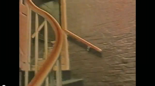
The first show is a tracking shot going up the stairs of the mill, the hazy orange-yellow is there to set up the mood of the song which is about loss and regret


The camera has a close up on a door into the factory room, the one clear etching says "Ian.C" which is done by the late lead singer


The door swings open and we get an establishing shot of the factory room to see where they are, the dark empty space illustrates the nature of the video


The effect changes and the light is more neutral now but also the shadows are more prominent then before giving it an even darker feel


The key board kicks in and then in a straight edit we see one of the members playing it in the same room we see before


Stephen Morris has a close up while playing drums, his instrument is the most heard for the few seconds he is on camera here


Peter Hook then gets a mid-shot, each of these shots are aiming to introduce each member of the band


The band is captured with a wide shot in the room as the establishing shot, Ian Curtis is in the centre to how his importance 


Bernand Sumner receives a close up as well to introduce him


The singing kicks in and the camera arcs round from Sumner to see Ian Curtis gripping the microphone holding his vox teardrop


Curtis is then subject to a mid-shot which shows more of his dreary facial expression and motionless charisma


A mid-shot of Stephen Morris captures him after the first verse, this shows him unique drumming style which has become very influenctial over time


The red glow effect returns and we see the mid-shot of Curtis again, this affect again trys to show the dark nature of the video


The camera zooms out and we see Peter Hook playing with Ian Curtis, the slow pace the camera moves out at says that the song is quite serious


The bass is the most prominent instrument at this point so we get an exteme close up of the Hook's bass to make the listener concentrate on that aspect of the song


The camera rises and we get a close up of Peter Hook while he is playing bass


The emotion of the song is coming through more and more as the song progesses, this close up of Ian Curtis shows his facial expressions more to try and make the listener feel the emotion behind it


The red glow effect is taken away and purer light is used again, the camera  closes up at Ian Curtis's guitar while he plays one of his few parts throughout the song


The keyboard comes back in, although no key board is seen in any shot of the band it comes back in, we don't know who is playing it either giving the video an eiry sense


The camera arcs from right to left showing all of Stephen Morris' drum kit and his style as a drum roll is more important than other instruments in the song


An upwards tilt shot is used as we look up to Peter Hook, this could be to show his importance in the song at this point or even his importance in the band as a whole


 The red glow effect returns and we get a close up of Ian Curtis, the song is getting closer to the ending and Ian Curtis' facial expressions are becoming more and more emotive as displayed in this picture


Bernard Sumner has another close up, the song is in the chorus at this point so eac member is equally important


The chorus ends, we now get Bernard Sumner playing the key board rather than guitar and Ian Curtis has taken his limited guitar role


The camera zooms out and we get a wide shot of the whole band as the song is coming to its climax


Peter Hook gets another close up of his bass, this is like the first show of them but rather than introducing them its the opposite, almost a send off for each member


Stephen Morris receives a mid-shot for the same purpose of Hook's close up, almost an outro for him


Just as Hook and Morris before him Bernard Sumner gets a close-up for the same purpose


Ian Curtis's guitar gets an extreme close of his guitar because its the main instrument at this point


Just like the beginning of the video we see the same door in the same red glow effect, this make the viewer wonder what its all about and why its so frequent


The door opens again and the room is empty as it was at the begining of the video, this could be a metaphor for saying that Joy Division are gone after Ian Curtis had died